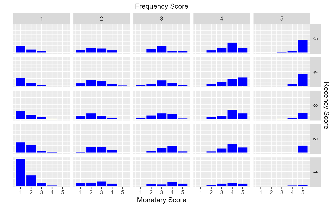
Examine the distribution of monetary scores for the different combinations of frequency and recency scores.
Usage
rfm_bar_chart(
  rfm_table,
  bar_color = "blue",
  xaxis_title = "Monetary Score",
  sec_xaxis_title = "Frequency Score",
  yaxis_title = " ",
  sec_yaxis_title = "Recency Score",
  print_plot = TRUE
)
Arguments
- rfm_table
An object of class
rfm_table.- bar_color
Color of the bars.
- xaxis_title
X axis title.
- sec_xaxis_title
Secondary x axis title.
- yaxis_title
Y axis title.
- sec_yaxis_title
Secondary y axis title.
- print_plot
logical; if
TRUE, prints the plot else returns a plot object.
Examples
# using transaction data
analysis_date <- as.Date('2006-12-31')
rfm_order <- rfm_table_order(rfm_data_orders, customer_id, order_date,
revenue, analysis_date)

# bar chart
rfm_bar_chart(rfm_order)