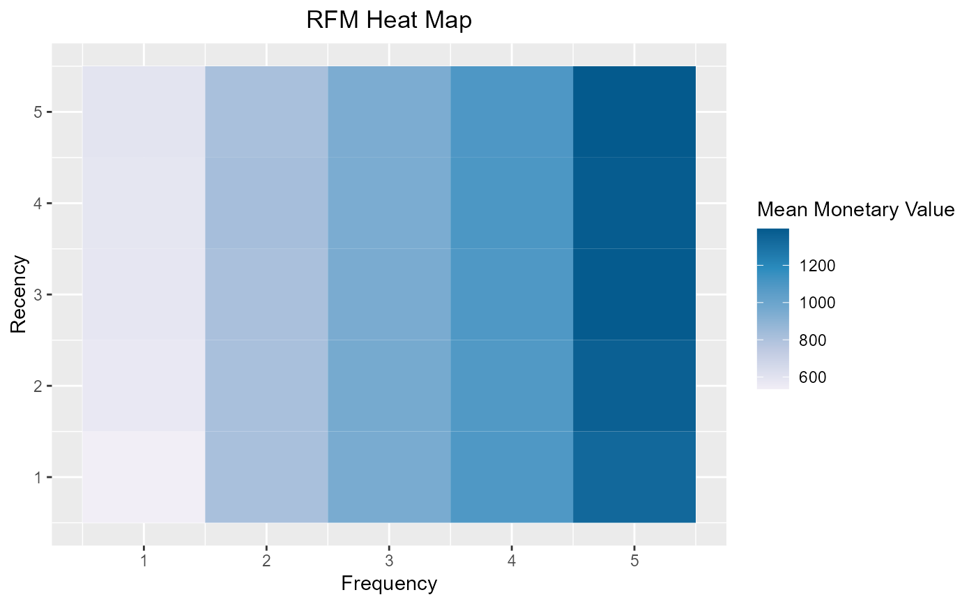
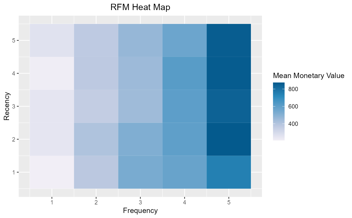
The heat map shows the average monetary value for different categories of recency and frequency scores. Higher scores of frequency and recency are characterized by higher average monetary value as indicated by the darker areas in the heatmap.
Usage
rfm_heatmap(
  data,
  plot_title = "RFM Heat Map",
  plot_title_justify = 0.5,
  xaxis_title = "Frequency",
  yaxis_title = "Recency",
  legend_title = "Mean Monetary Value",
  brewer_n = 5,
  brewer_name = "PuBu",
  print_plot = TRUE
)
Arguments
- data
An object of class
rfm_table.- plot_title
Title of the plot.
- plot_title_justify
Horizontal justification of the plot title; 0 for left justified and 1 for right justified.
- xaxis_title
X axis title.
- yaxis_title
Y axis title.
- legend_title
Legend title.
- brewer_n
Indicates the number of colors in the palette; RColorBrewer is used for the color palette of the heatmap; check the documentation of
brewer.pal.- brewer_name
Palette name; check the documentation of
brewer.pal.- print_plot
logical; if
TRUE, prints the plot else returns a plot object.
Examples
# using transaction data
analysis_date <- as.Date('2006-12-31')
rfm_order <- rfm_table_order(rfm_data_orders, customer_id, order_date,
revenue, analysis_date)

# heat map
rfm_heatmap(rfm_order)


# using customer data
analysis_date <- as.Date('2007-01-01')
rfm_customer <- rfm_table_customer(rfm_data_customer, customer_id,
number_of_orders, recency_days, revenue, analysis_date)

# heat map
rfm_heatmap(rfm_customer)
# using customer data
analysis_date <- as.Date('2007-01-01')
rfm_customer <- rfm_table_customer(rfm_data_customer, customer_id,
number_of_orders, recency_days, revenue, analysis_date)
# heat map
rfm_heatmap(rfm_customer)